김창한
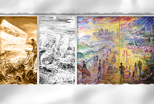
‘바다, 찬란한 생명의 환희(Sea-Vital Fantasy)’ 시리즈는 2005년 호주 방문 때부터 시작됐다. 국내는 2011년 부산/울산에서 시작됐으며 지금은 강원도~제주도는 물론 해외로 그 범위를 넓히고 있다. 바다 시리즈 작품은 일반적인 풍경으로서의 아름다움 보다 현장에서 느끼는 자연과 인간의 역동적이고 박진감 넘치는 모습과 삶의 기쁨과 즐거움을 그린다. 그래서 서핑/윈드서핑/일출/일몰/파도가 좋을 때면 시간과 장소를 불문하고 현장에서 캔버스를 펼친다.
본인은 작품을 시작할 때 작품구상(밑 스케치)을 치밀하게 계산해서 그리지 않는 편이다. 대신 가슴으로 느낀 감동을 머릿속으로 구상해서 그릴 때가 많다. 이것은 매우 막연하고 추상적일수도 있지만 매우 구체적이고 사실적인 경험에 근거를 두기에 그림의 방향이 분명하다.
작품 표현양식은 실경(實景)을 바탕으로 파도의 환상을 심상적/추상적/초현실적으로 표현하고자 했다. 그리고 그림의 회화적인 맛을 중요시하기에 색의 맑고 싱그러운 경쾌한 리듬감, 질감 그리고 중후한 마티에르를 강조했다. 또한 보색(반대색)대비와 원색이 돋보이지만 색이 가볍거나 덜 익은 느낌이 들지 않도록 전체적인 색의 조화에도 신경 썼다. 유화로 그렸지만 보조기름인 Liquin을 사용하면서 유동성 있는 표현과 르프랑 Lefranc(프랑스) 유화물감의 장점인 맑고 투명한 느낌을 강조했다. 앞으로 바다 시리즈는 더욱 환상적인 분위기와 현장에서 만난 다양한 사람들의 건강한 삶의 이야기를 담을 것이다.//김창한//
The “Sea – Vital Fantasy” series began while visiting Australia in 2005. I took my interest of seascapes home and began expanding on the series in Busan/Ulsan by 2012. I will continue this series adding foreign locations as I get the opportunity to travel.
The work in this series is not meant to be only about beauty, it is intended to reveal a dynamic interplay between nature and human energy, perhaps the key to a joyful of life. Ultimately, it’s why I try to capture the wind, sun, and surf. It is there, where joy seems the most alive. That is also why I physically go to the place and experience it first hand. While I paint I can bask in that warmth. I don’t approach it with a detailed plan. Like the surfers I am trying to go with the flow. I’m not concerned with being too vague or abstract. I am confident that since it is coming from my actual experience, it is my expression’s truest form.
The work is a mix of reality and fantasy. The reality is I’m there looking at the waves, but in their ebb and flow I see abstraction. It’s moving, and it’s surreal, so I try to allow the expression of that.
Also, I love art. I use its language. I emphasize the rhythm of brush strokes and surface texture. I use fresh and cheerful colors. I try to convey more of how it feels than how it looks. While I employ complementary and primary color schemes, I often favor a full spectrum. It seems natural to use all the colours. I also try to utilize the liquidity/fluidity of fine art materials. I use media (Liquin) and high quality French oil paint. I want to tell my stories with vivid colours and flowing brushwork.
For me, this has indeed become a ‘vital fantasy’. I will continue to visit new shores and share with people from around the world.
– 장소 : 금련산갤러리
– 일시 : 2016. 6. 28 – 7. 3.
추PD의 아틀리에 / www.artv.kr / abc@busan.com